Sruti Gandreti
Mysa

Building Visual Identity at Mysa

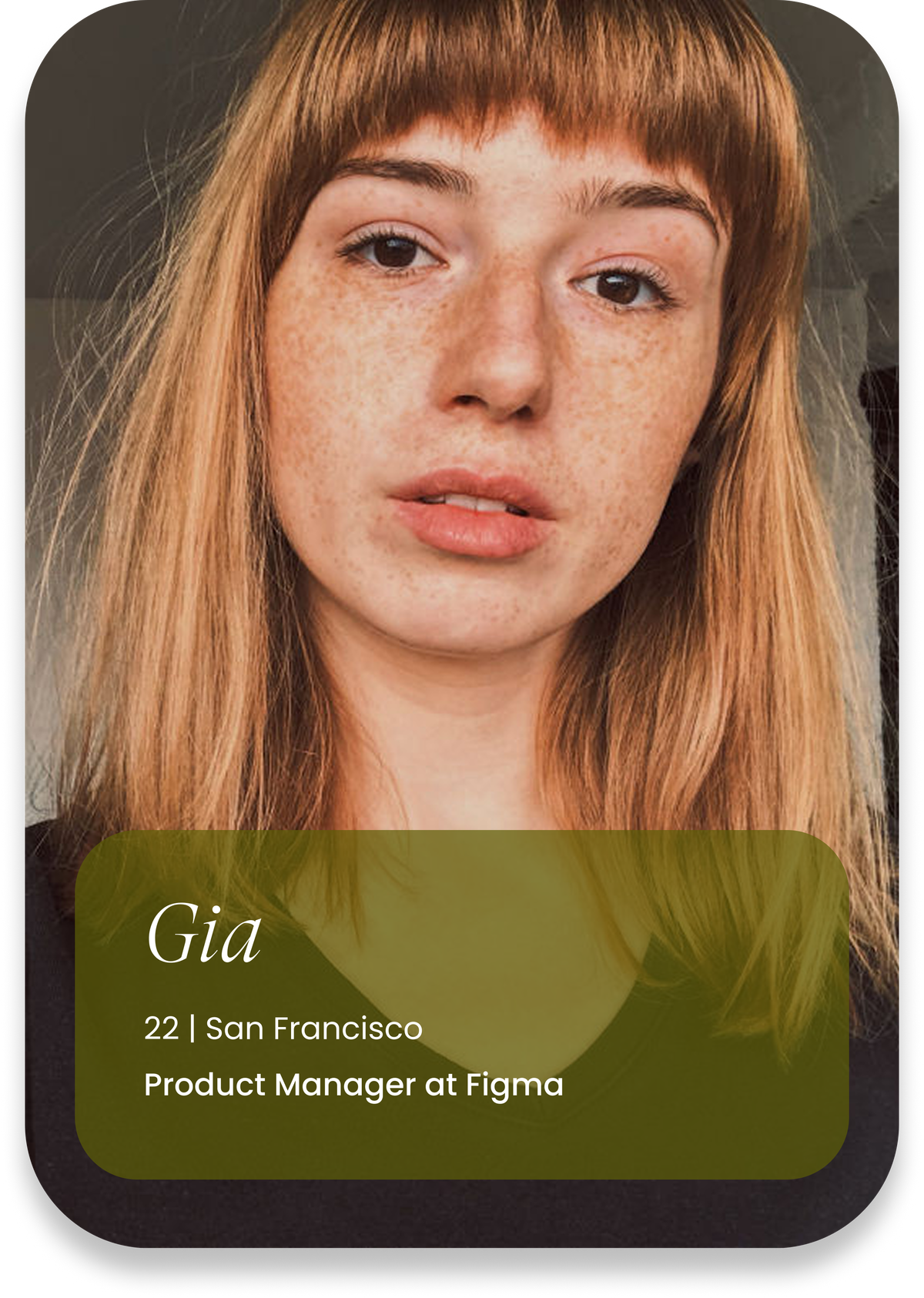
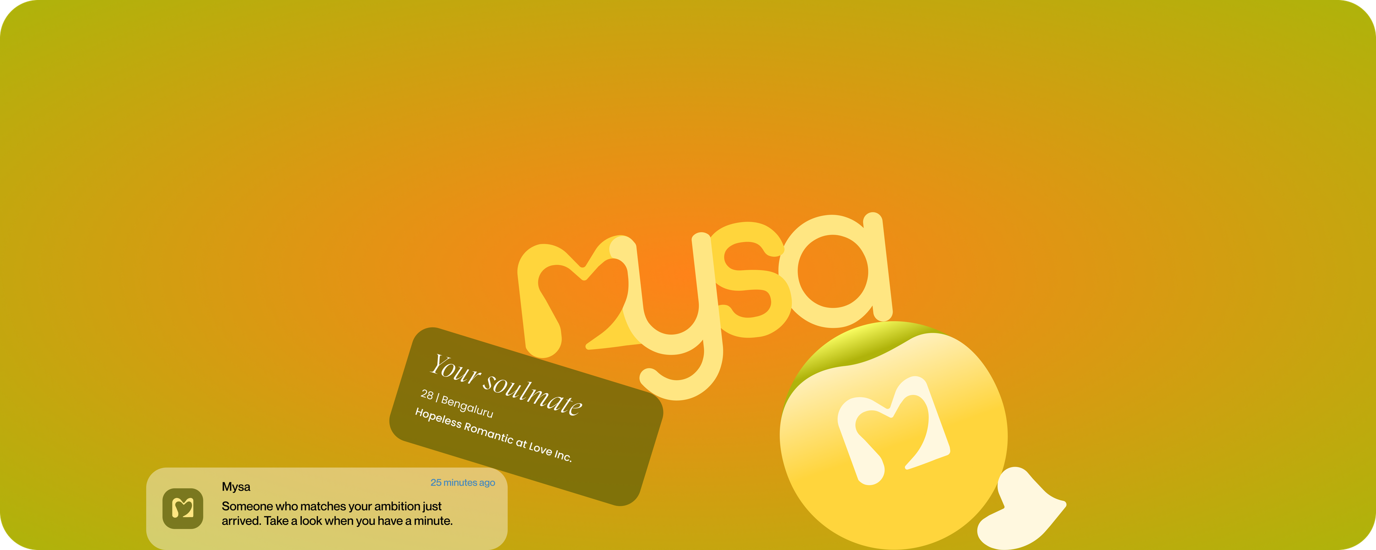
Mysa reached 15,000 signups in its first month — driven mostly by social marketing. This is the brand I built from scratch that made it possible.

Timeline

Aug – Dec 2025

Role

Creative Director

With

Ankitha Chinthalgattu

(Founder)

Disciplines

Brand Identity

Creative Direction

UX Design

Visual Storytelling

The Challenge

You pour everything into your career. So why should finding connection feel like even more work?

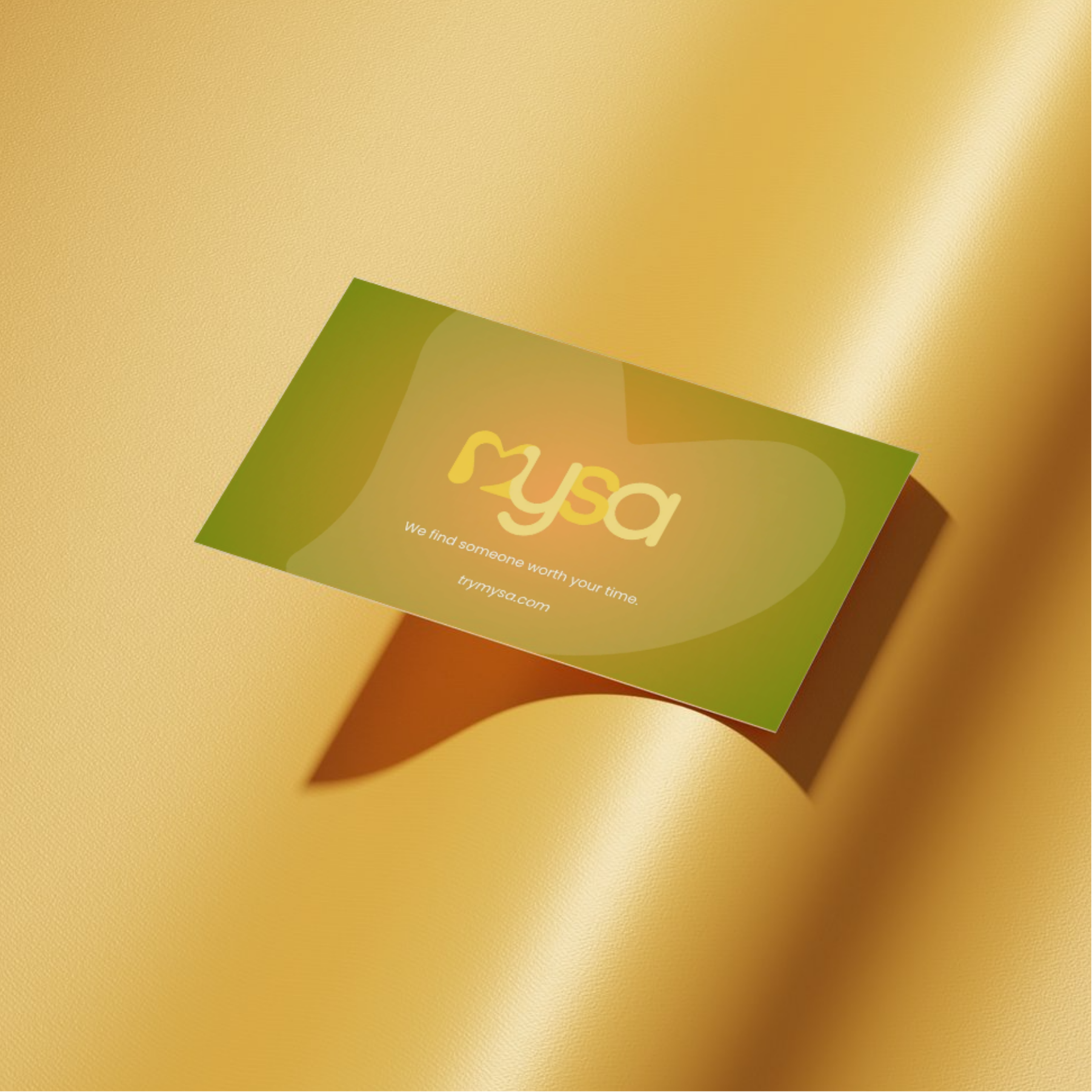
Ambitious singles already give everything to their work. Dating should be the one place that shouldn't drain them. Mysa is an early-stage AI dating startup built for people who don't have time to waste, designed from the ground up to feel like a soft place to land.

You have 12 new matches today

but you have no time.

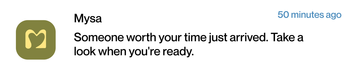
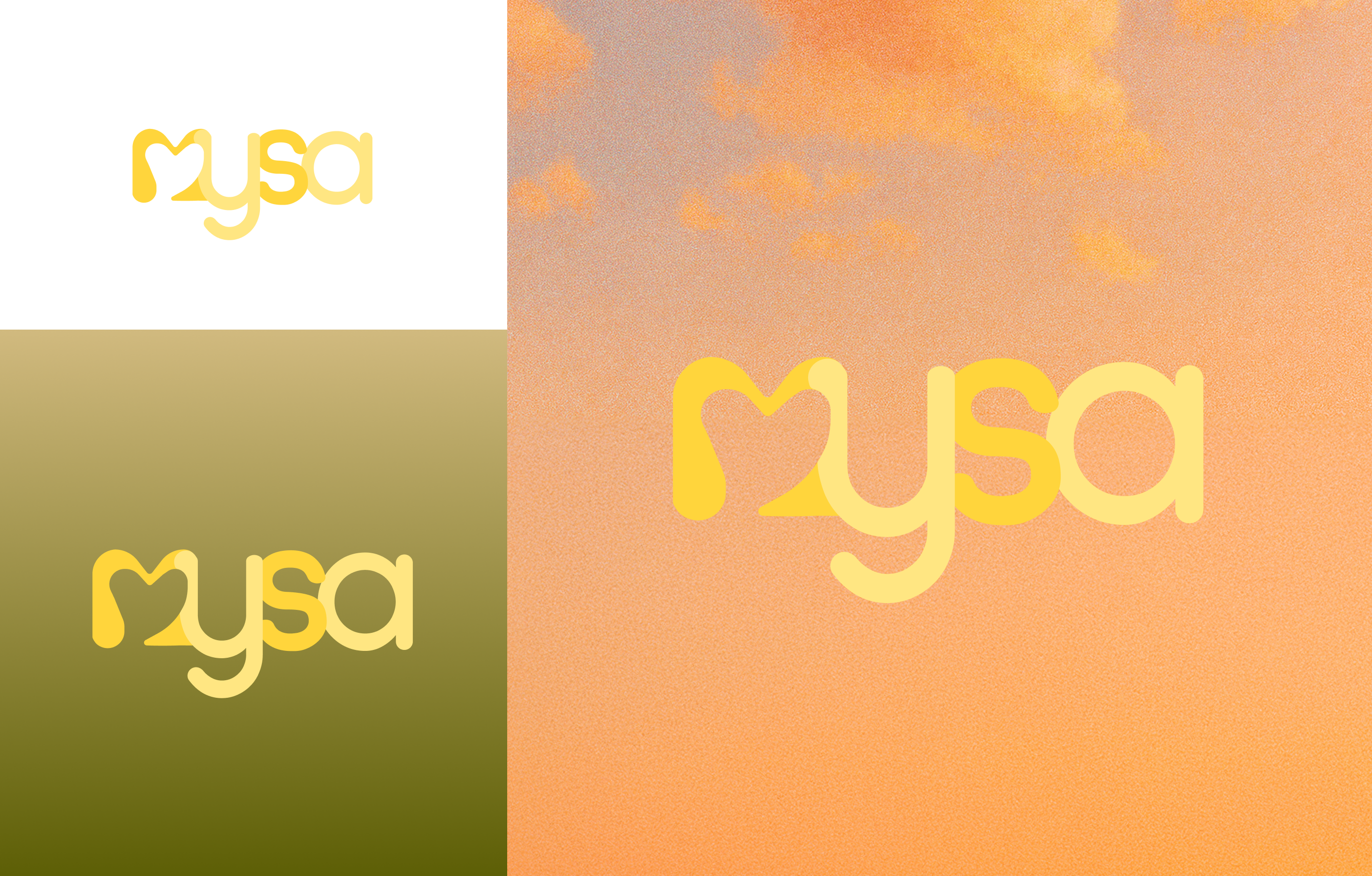
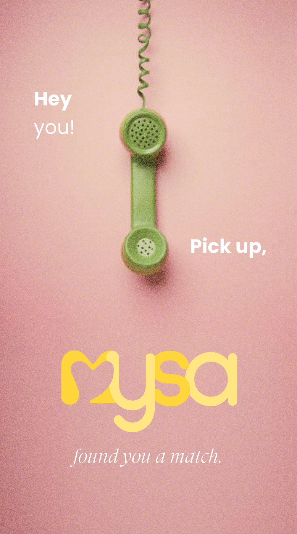
What does Mysa mean?

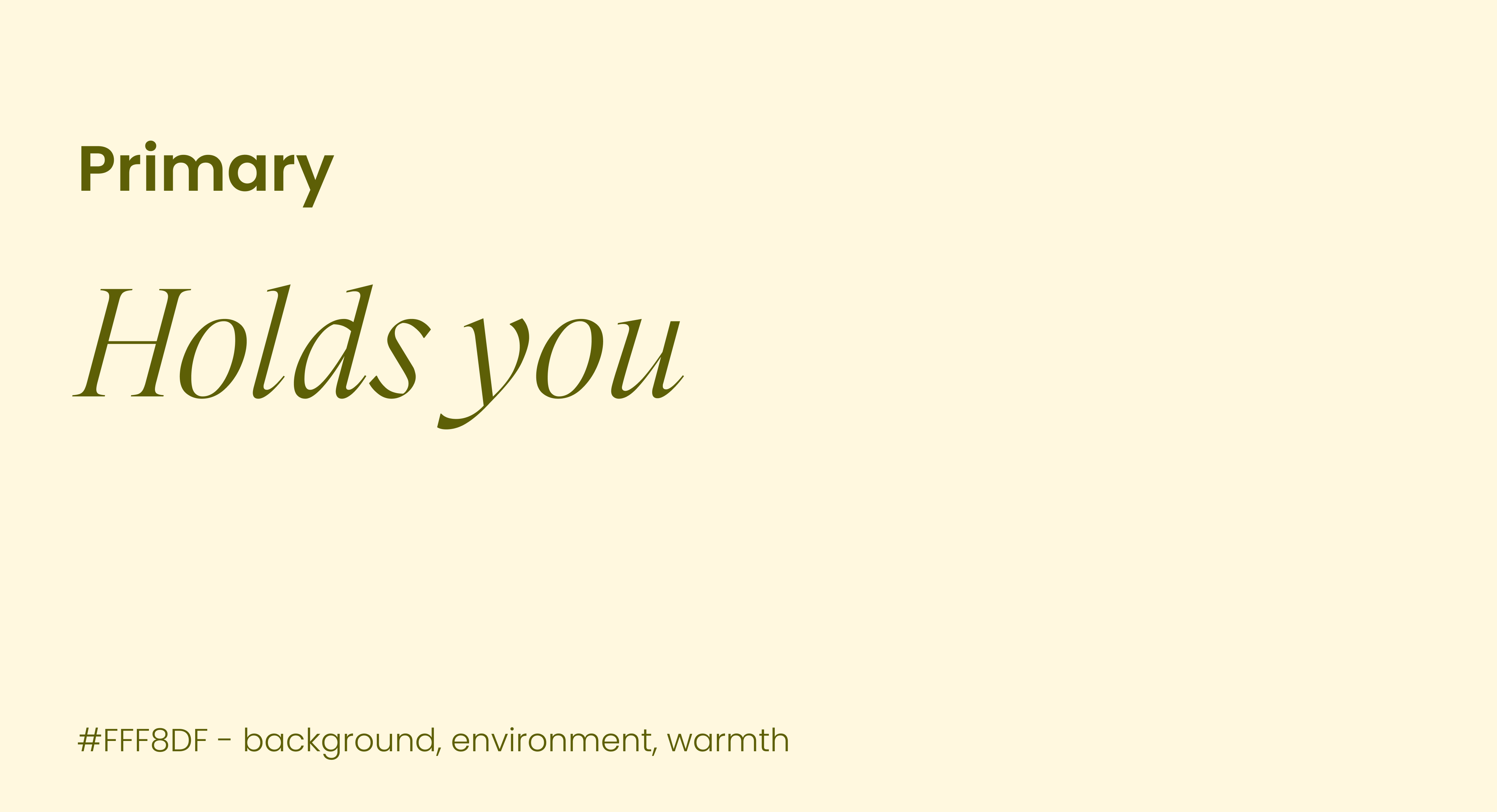
Pronounced “mee-sah,” Mysa comes from the Swedish concept of coziness, comfort, and emotional warmth.

It's the feeling of being safe, understood, and completely at ease. That feeling sits at the heart of how we think dating should feel.

Owning Design

I was brought in as the sole designer to build Mysa's brand from zero.

Starting from a blank canvas, I translated Ankitha's vision for what Mysa should feel like into every visual decision. Working directly with Ankitha, I ran weekly alignment sessions to pressure-test creative direction against her product goals.

Brand Strategy

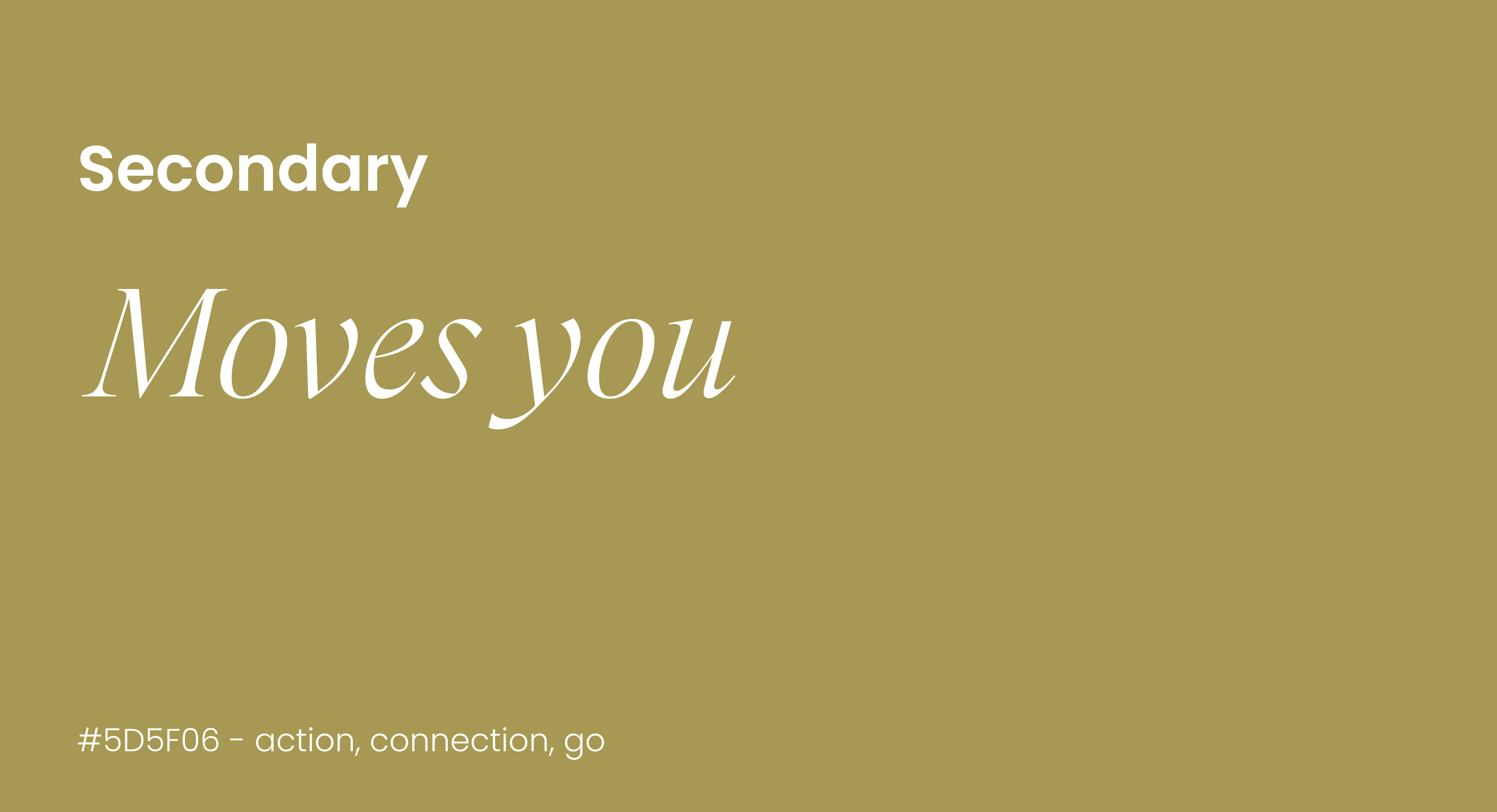
Most dating apps are built around volume and retention. More swipes, more matches, more time on the app. Mysa has the exact opposite goal.

Featuring fewer distractions, deeper compatibility, and a brand that earns trust before it asks for vulnerability.

Warmth over urgency

Mysa notification — Someone worth your time just arrived.

Transparency always

Upgrade to see who already liked you.

Your match this week
Match — Gia, 22, Product Manager at Figma

You matched because

You both described your ideal week the same way.
Full of work you care about, no rush, movie nights.

Compatibility over volume

50+ likes

91% compatibility

on what matters

Visual System

The logo needed to embody safety. Warmth while standing out from competitors.

I tested various directions, narrowing toward a mark that had strong legibility, cohesion, and softness.

v.1v.2v.3
Mysa logo versions v.1, v.2, v.3

tested the heart-shaped "m"

handwritten look? trying to make the "m" more obvious

getting closer but needs more cohesion

Mysa logo on white, green, and sky

Typography and Color

Headers & Body: Poppins

Accent: GT Super Display (Light Italic)

Mysa primary cardMysa secondary card
Mysa business card
Mysa ad

Results?

15k+

sign-ups

1 month of launch

25k+

sign-ups currently

“Feels different from every other dating app”

repeated user feedback received about Mysa

Reflections

Building the brand from 0

Designing a brand from scratch came with an exciting amount of creative freedom but also the pressure of owning every decision. With no existing system to build from, I had total responsibility over the visual direction, which meant every choice needed to feel both beautiful and strategically aligned with Ankitha's vision for the app. It pushed me to think beyond aesthetics and design a brand identity that felt emotionally resonant, memorable, and purposeful from the ground up.

Art of Collaboration

This process involved constant collaboration, feedback loops, and refining ideas until they truly clicked. Ankitha and I worked closely together throughout the branding process, especially when shaping the final logo, balancing her vision with thoughtful design decisions that would scale across the product experience. The back-and-forth was challenging at times, but it ultimately made the outcome feel far more aligned, intentional, and rewarding.